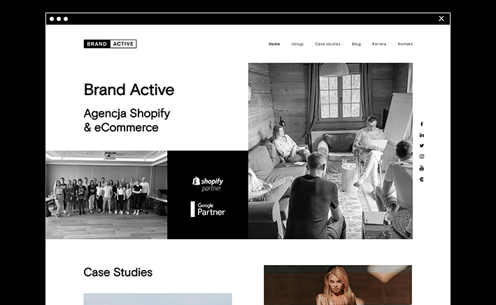
On December 10th 2020 Brand Active’s new website came out. As a Shopify & E-commerce agency we specialise in e-commerce. Constant development that we observe in our company is also associated with the already implemented changes in the Visual Identity System.
The new Brand Identity Design consists of such elements as: a logo, colours, a font typeface, a layout of Brand Active page, social media materials, a footer, e-mail messages, a headline, presentations, clothing, an office space
A new claim
Brand Active – Shopify & eCommerce agency
The new claim is a consequence of our strategy, which we have followed in 2020 and on which we will be counting on in the coming years. “eCommerce” is a part of the market on which we focus and develop our competences. “Shopify” is the whole ecosystem which is the basic workshop for the growth of online shops in the whole world.
Logo
The Brand Active logo was supposed to be a timeless element of the company. Changing the approach to design and meeting current market trends, we decided not to change the whole concept, but to focus on the most important aspects such as colour, a font typeface and its future use. The existing logo was based on blue and black colours on a rectangular shape with words inside it.

The typeface has also been changed to a distinctive geometric shape. The font not only looks brand new in comparison to the previous version of the logo, but also, thanks to the new typeface, the current logo is legible even in small sizes.
For a long time, both internally and in communication with clients and partners, we have been using the replacement name of our agency using the abbreviation “BA”, which will also appear in our publications as an element of the Visual Identity System.
![]()
Colours
We used classic colours: black, white and gold.

Black is a symbol of strength and authority. Although it is often associated with strong and sometimes even negative emotions, above all, it is the colour of seriousness and elegance. E-commerce uses black mainly as a primary or secondary colour to emphasize these qualities, while in a minimal amount it is used to emphasize calm and simplicity.
White was used in order to create a strong contrast. Thanks to it, the identification becomes transparent and simple. White as well as black emphasizes style and elegance. It also has a positive impact on the perception of users.
Gold is the highest form of yellow. It has been reserved to highlight the most important information in the new visual identity. The golden colour inspires trust, indicates stability and solid foundations in building a company.
Brand Active’s new website
The new layout is the visual response to a coherent concept for all communication and promotion activities carried out in Brand Active thanks to which our agency reaches a very wide audience in Poland and abroad.

Design tool – FIGMA
All the work was done in the application for designing interfaces – Figma. This tool is appreciated not only by designers but also developers. It provides all the tools needed at the design stage, including vector tools, which are able to fully create illustrations, as well as the ability to prototype and generate a code to pass on. Figma is available on a browser and there are applications to download to your computer for both Windows and Mac OS. Moreover, it allowed several people to work together on the project of a new Brand Active layout in real time, thanks to which each person from the team was up to date with it, and the work on the implementation was smooth and proceeded at a fast, satisfactory pace.

The view of a home page design stage in FIGMA application.
Summary
An important element in the design was focusing on the users, so that the user’s experience and the new identification was well perceived. By changing the identification, we wanted to maintain and at the same time unify the whole communication of the brand, which stands out on the market. We want to be associated as a constantly developing Shopify & eCommerce agency, therefore we believe that the changes we have introduced will act as a clear signal to our users.


